18.1 Structure
Below is an overview of all structures used in connection with Layout Builder templates. The individual structures are presented in detail in the subchapters.
Template \<head>
| Structure |
|
|---|---|
| Doctype |
|
| Unicode |
|
| Title |
|
| Viewport |
|
| IE=edge |
|
| CSS integration |
|
| border collapse for |
|
| Outlook 9+ |
Template \<body>
| Wrapper table | Represents stage in full width or sets background color |
|---|---|
| Outlook table | Creates table that is only considered by Outlook and Internet Explorer |
| Content table | Defines the alignment again |
| Rows | Automatically creates predefined code for new lines |
| Columns | Provides automatic adjustment of the display of columns |
| Outlook Wrapper | Creates additional column for Outlook, which stores the calculated width |
| The column | Makes sure that the column has the maximum width |
| Alignment of columns | Controls the alignment of elements |
| Inner content and building block | Creates a table around the block |
18.1.1 Template \<head>
The template consists of freely editable HTML and two dynamically filled components the CSS in the header and the user-generated "layoutBody".
In the template, we have tried to save you the work for the most important basic settings. In the following chapters, we will explain what was defined.
18.1.1.1 Doctype
The Doctype is predefined as \<!DOCTYPE html PUBLIC "-//W3C//DTD XHTML 1.0 Transitional//EN" "http://www.w3.org/TR/xhtml1/DTD/xhtml1- transitional.dtd">. AGNITAS found that this document type causes the least problems with our templates but you can change it as you like.
18.1.1.2 Unicode
With the parameter \<meta http-equiv="Content-Type" content="text/html; charset=utf-8" /> the layout informs the client of the recipient that Unicode characters should be read. This increases the probability that your special characters used in the newsletter, such as ä, ö, ü and ß are displayed correctly.
18.1.1.3 Title
The Title tag, e.g. \<title>A Simple Responsive Email\</title>, is used to set the title in the browser preview. This has no effect on your email.
18.1.1.4 Viewport
\<meta name="viewport" content="width=device-width, initialscale= 1.0"> is responsible for scaling the image section on the displaying device to the correct size. This ensures the correct display (narrow image section) on mobile devices.
If this parameter is missing, the mail is displayed with the width defined in the grid. If this width is larger than the screen of the displaying device, the mail is displayed with scroll bars. We therefore recommend not to change this parameter if you want to create a responsive newsletter.
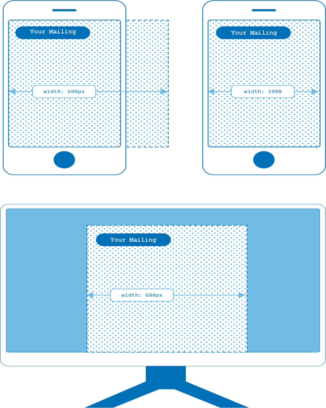
Fig. 18.1: Adjusting the screen area
18.1.1.5 IE=edge
With the parameter \<!--[if !mso]>\<meta http-equiv="X-UA-Compatible"
content="IE=edge" />\<![endif]--> we give Microsoft based systems the information how to display the HTML. IE=edge instructs the browser to use the highest compatibility mode available.
The if statement \<!--[if !mso]>\<![endif]--> ensures that this statement only applies to
Microsoft Outlook based clients to prevent display problems with Windows Live Mail.
18.1.1.6 CSS integration
Here the CSS from the CSS tab of the Layout Builder is integrated. The placeholder for this is [gridPH name="templateCSS"] - please do not remove this placeholder, otherwise the input from the CSS tab can no longer be considered. Of course, you can optionally include additional CSS before and after this placeholder. This could look like the following: \<style type="text/css">
Your individual CSS
[gridPH name="templateCSS"]
Your individual CSS
\</style>
18.1.1.7 border collapse for Outlook 9+
The following code block forces Outlook 9 and newer versions not to render the margins. This minimizes unwanted holes in the layout.
\<!--[if (gte mso 9)|(IE)]>
\<style type="text/css"> table { border-collapse: collapse; }
\</style>
\<![endif]-->
18.1.2 Template \<body>
The standard body that we have defined for you in the template is the basis for your responsive mailing. It contains some concepts that are important for the correct presentation. In the following we explain the structure:
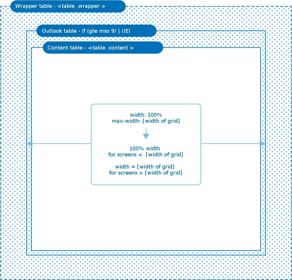
Fig. 18.2: Schematic representation of the template body
18.1.2.1 Wrapper table
\<table class="wrapper"> opens the Wrapper table.
The wrapper class serves 2 purposes:
-
The class contains width: 100% and ensures that the stage (the mailing) spans the full width of the screen.
-
The class can be used as container for a background color which fills the whole screen. With the parameter bgcolor="#ffffff" you can add a color which is defined in the tab Styles of the mailing.
Furthermore Wrappers are used to do some basic formatting:
-
table-layout: fixed; adjusts the layout to the table width and not to the column contents
-
webkit-text-size-adjust: 100%; adjusts the font size on Webkit browsers (e.g. the iPhone)
-
ms-text-size-adjust: 100%; adjusts the font size on Microsoft browsers (including Microsoft Phone)
The Wrapper table contains a \<tr> and \<td>, the \<td> has a few additional parameters, depending on which alignment is desired for the layout. This looks like the following:
\<tr>
\<td class="center" align="center" valign="top">
…
\</td>
\</tr>
For the 3 alignments left, center and right the parameters align="left", align="center" and align="right" can be stored.
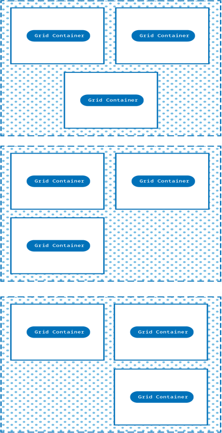
Fig. 18.3: Exemplary alignment of the columns
18.1.2.2 Outlook table
This way the E-Marketing Manager creates a table which is only considered by Outlook and Internet Explorer. It has the full width of the selected grid, in this case e.g. 580px. We assume here that Outlook and Internet Explorer are each viewed from a desktop screen. Thus the content in Outlook is displayed correctly across the full width. The code block can look like this:
\<!--[if (gte mso 9)|(IE)]>
\<table width="580px" align="center" cellpadding="0" cellspacing="0" border="0">
\<tr>
\<td>
\<![endif]-->
[…]
\<!--[if (gte mso 9)|(IE)]>
\</td>
\</tr>
\</table>
\<![endif]-->
Fig. 18.4: Outlook table with full width
18.1.2.3 Content table
The Content table \<table class="content"> is the last container before the actual grid containers created by Layout Builder. It determines the alignment again (see Alignment).
The following CSS statements are stored in the .content class:
- Margin: 0 auto; emoves any margin formatting.
Note: Margin is also capitalized in CSS so that Outlook.com does not overwrite the property, see the article from Campaign Monitor.
-
width: 100%; and max-width: 580px; make sure that the content on end devices takes up the whole width up to the maximum width (in the code example 580px).
-
background-color: \${background-color}; sets the background color specified under Styles in the Layout-Builder.
Fig. 18.5: Template width in different screen sizes
18.1.2.4 Rows
In the Layout Builder and later in the E-Mail Creator the content is organized in rows and columns. While the number of columns is determined at the beginning by the Grid used and cannot be influenced later in the mailing, rows can be added to the content at any time.
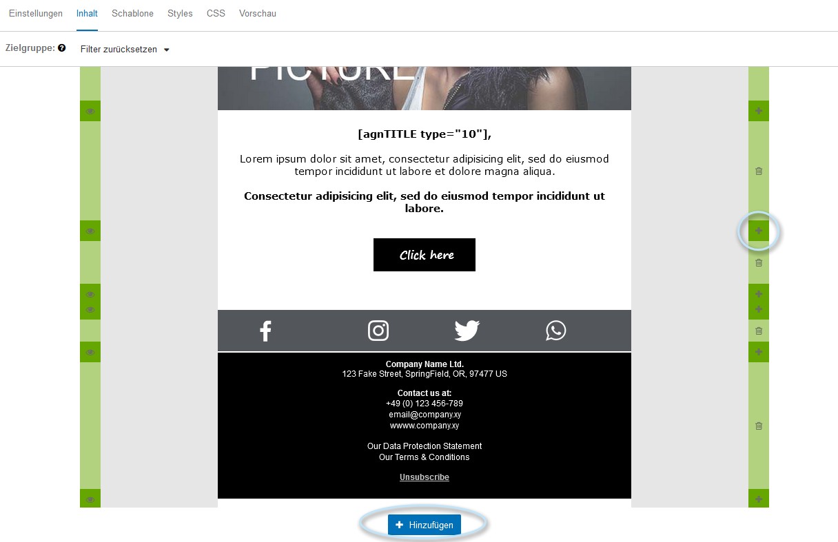
Fig. 18.6: Add rows
If a new row is added in the Layout Builder or in the email Creator, the following code is automatically generated later in the mailing
\<!-- for each row START -->
\<tr>
\<td class="grid-columns">
\<!--[if (gte mso 9)|(IE)]>
\<table>
\<tr>
\<![endif]-->
… (columns and blocks)
\<!--[if (gte mso 9)|(IE)]>
\</tr>
\</table>
\<![endif]-->
\</td>
\</tr>
\<!-- for each row END -->
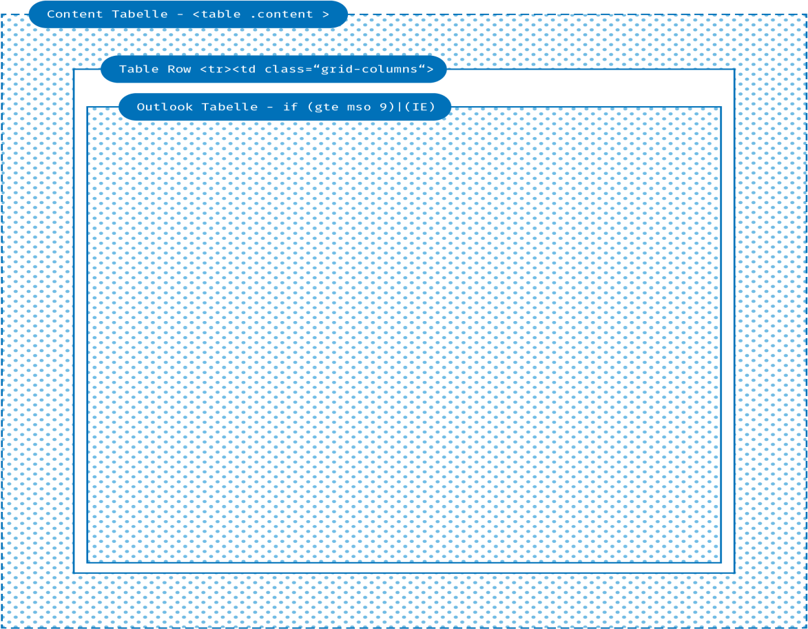
Fig. 18.7: Row within the content table
This means, for each row a new \<tr> and a new \<td> element is generated in the content table. The following attributes are defined for the .grid-columns class:
.grid-columns { text-align: center; font-size: 0px;
line-height: 0px;
}
In detail: text-align: center; is used to make the containers centered when they are displayed below each other on smaller screens. For other alignments we overwrite this attribute as follows:
.left .grid-columns { text-align: left;
}
.right .grid-columns { text-align: right;
}
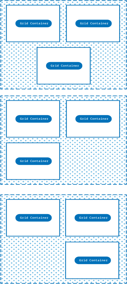
Fig. 18.8: Alingnment of containers in template
font-size: 0px and line-height: 0px are used to remove spacing between subsequent rows and columns. You will see that we use an inline-block element for the columns. Inline elements are treated like text. If several inline elements follow each other, they have some (unwanted) space between the elements, just like letters. If you set the font size and line spacing to 0px, you can remove this space.
Please note: This is also the reason why you should adjust the font size and line spacing manually. The EMM corrects this behavior later in the .inner class and increases it again to font-size: 12px and line-height: 14px but unfortunately the font sizes set by the browser are lost.
18.1.2.5 Columns
Columns are displayed next to each other in one row. If the width of the screen is not sufficient for the complete display of all columns, they are wrapped and displayed one below the other. The number of columns is determined in the Layout Builder by selecting the underlying grid. The Grid is selected when creating a new layout and cannot be changed afterwards.
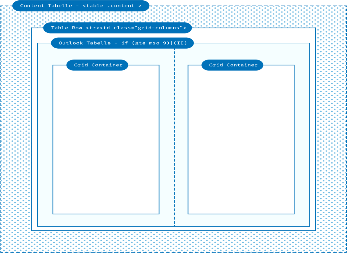
Fig. 18.9: Schematic representation of the columns
The code for columns looks like this:
\<!-- for each cell START -->
\<!--[if (gte mso 9)|(IE)]>
\<td width=„580“ valign="top"> \<![endif]-->
\<div class="column" style="max-width: 580px">
\<table cellpadding="0" cellspacing="0" border="0">
\<tr>
\<td class="inner" style="padding-left: 10px; padding-right: 10px; padding-top: 10px">
[building block of the user]
\</td>
\</tr>
\</table>
\</div>
\<!--[if (gte mso 9)|(IE)]>
\</td>
\<![endif]-->
\<!-- for each cell END -->
18.1.2.5. Outlook Wrapper
1
For Outlook an additional table and \<tr>\<td> is generated, in which the calculated width is stored. We calculate the width (indicated in the code as: 580px) using the columns in a row and the maximum width indicated in the grid.
Most other clients and browsers interpret the \<div class="column"> with a max-width, which is calculated in the same way as the maximum width in the Outlook cell, i.e. grid width divided by the number of columns in the row.
18.1.2.5. The column
2
width: 100% makes sure that the column takes the maximum available width. The maximum width is set inline. The code block for this looks like this
.grid-columns .column{ width: 100%; display: inline-block;
vertical-align: top;
}
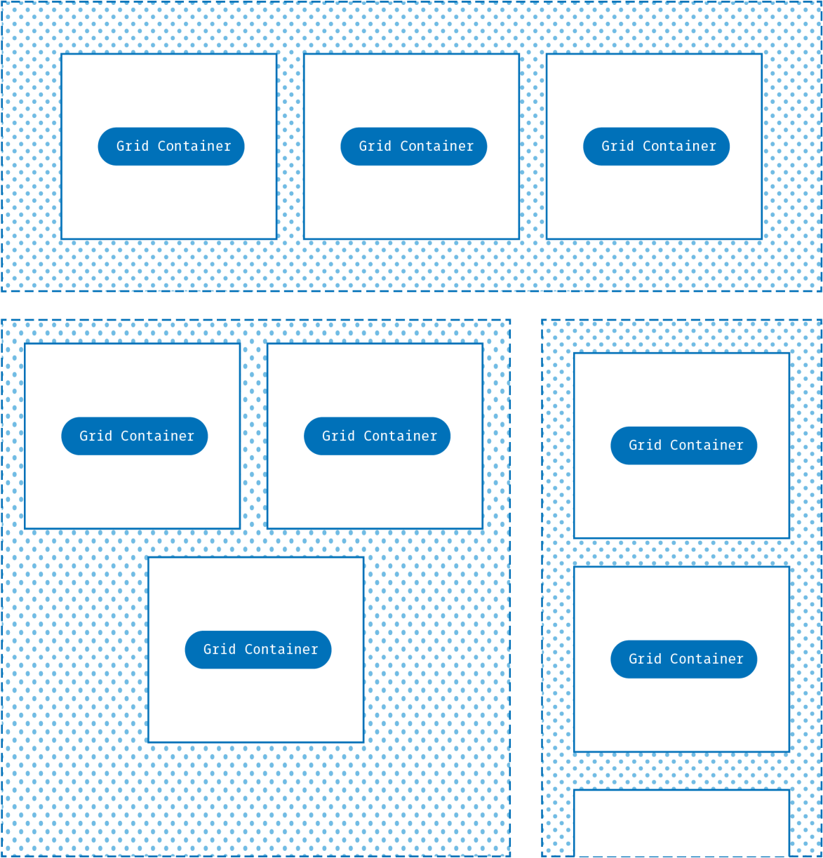
Fig. 18.10: Possible display variants for column width width: 100%.
display: inline-block converts the \<div> into an inline block element. This has the following effects:
If there is enough space on the screen, the containers are displayed next to each other. If there is not enough space, they break (just like text) into a new line.
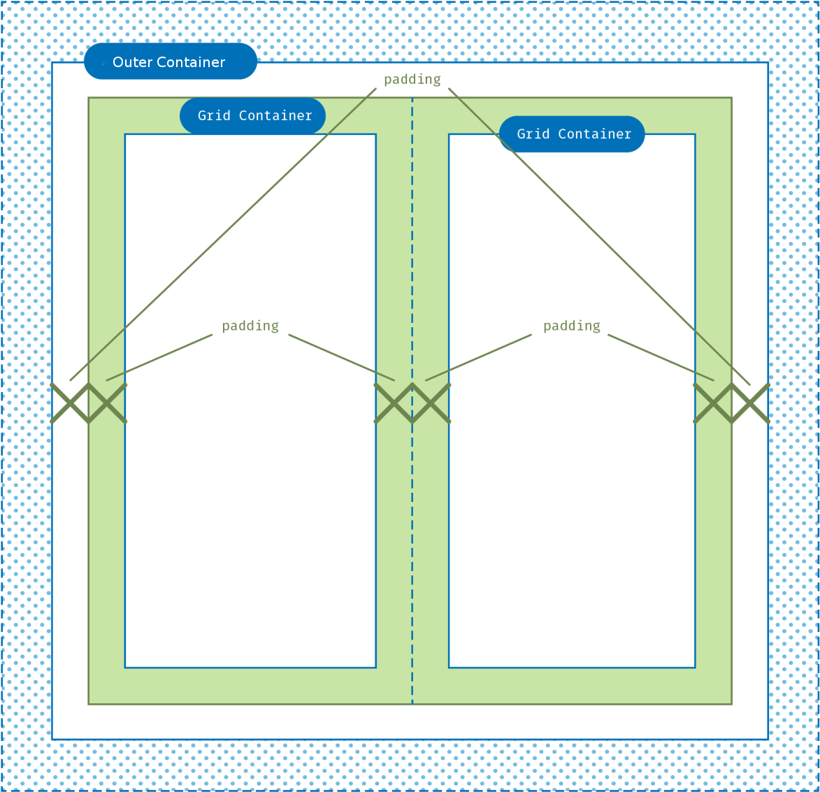
Fig. 18.11: Padding of columns
The padding, i.e. the left and right column spacing, is written inline to the .inner element and corresponds to the column spacing specified in the grid.
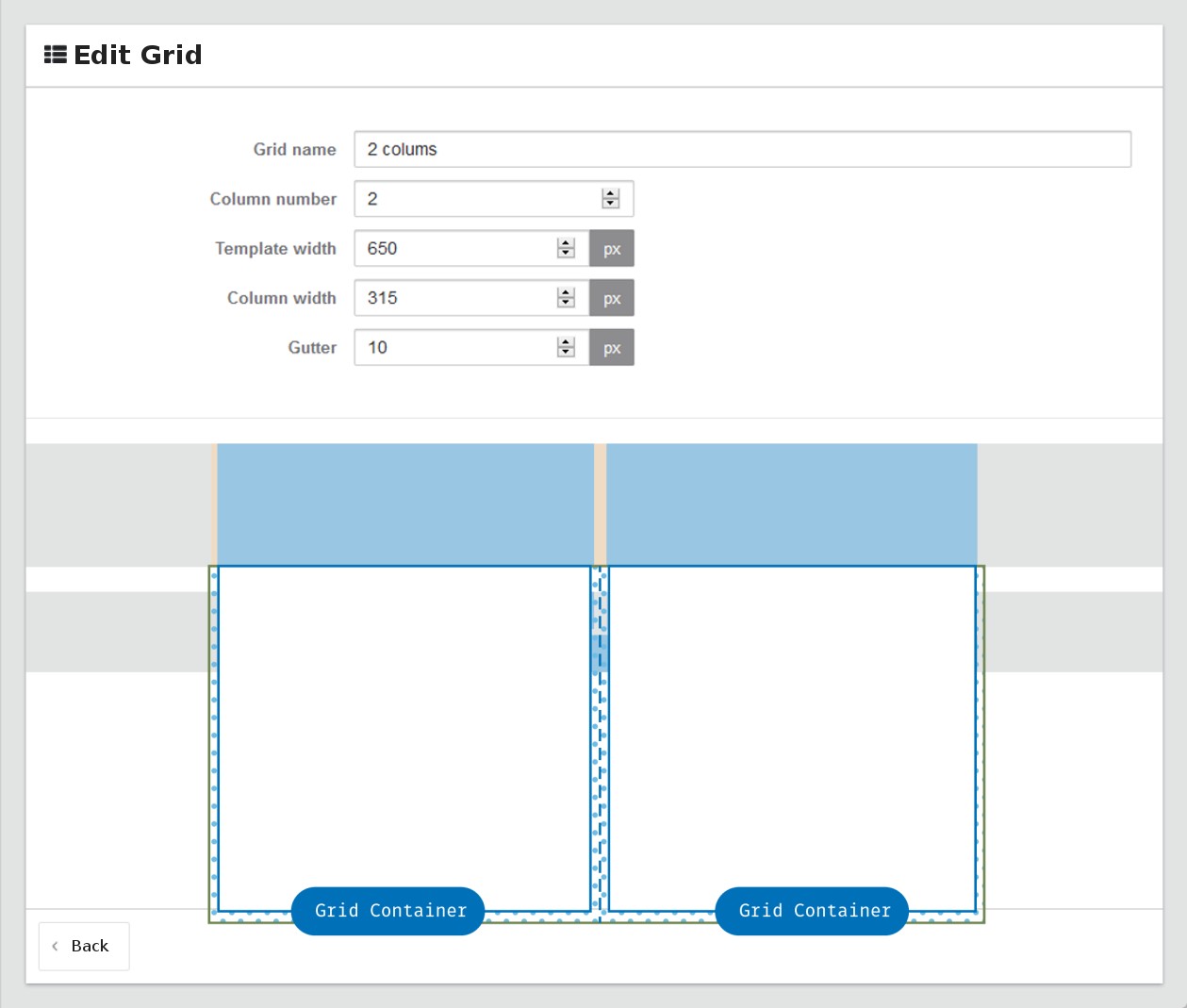
Fig. 18.12: Example grid with two columns
18.1.2.5. Alignment of columns
3
Depending on which text-align is inherited (our default is text-align: left) the elements are left, centered or right-aligned when they wrap.
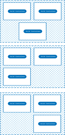
Fig. 18.13: Alignment after line break
vertical-align: top ensures that the containers are aligned at their top edge (and not centered as it is the default in some browsers/clients).
18.1.2.5. Inner content and building block
4
The actual content of the block (specified as [Block] in the code) has two formats that are not directly visible. A table with the class .inner is created around the block. This table contains the following formatting:
.inner { font-size: 12px;
line-height: 14px;
}
As mentioned before, font size and line spacing are restored here (after having previously been removed for .grid-columns).
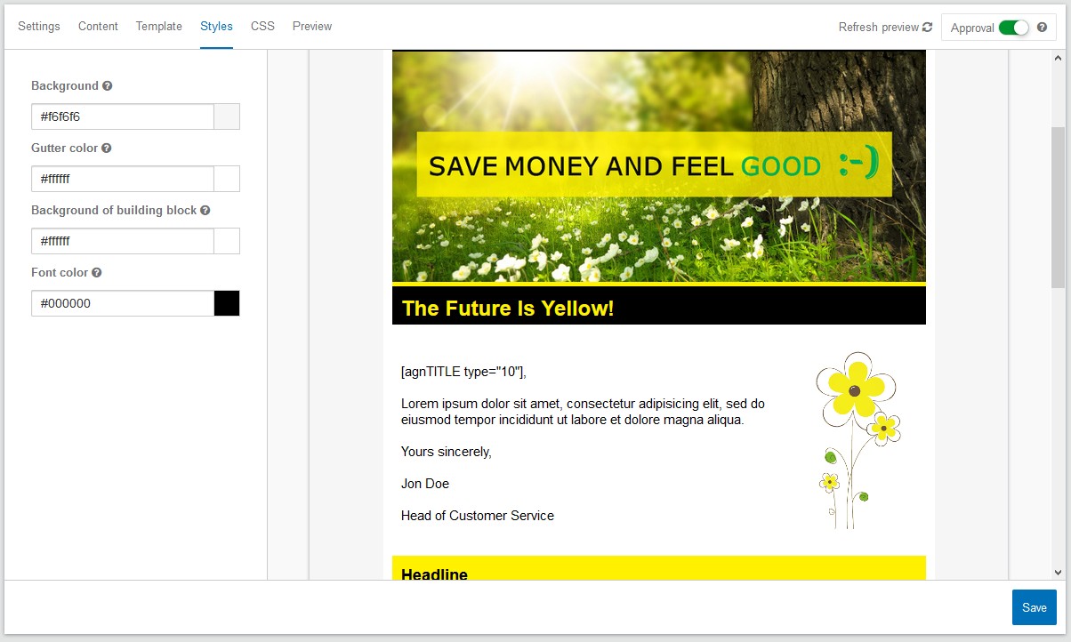
Fig. 18.14: Customizable parameters in the Style tab
The module has some attributes that are assigned to the .div-container class and can be changed in the Style tab of the Layout Builder mailing.