13.3 Layout Builder
You access the Layout Builder directly from the main menu of the E-Marketing Manager by clicking on the Layout Builder entry. If the E-Marketing Manager shows the Grid submenu, you have the Layout Builder with Grid. If the Grid submenu does not exist, then you are using the Layout Builder without a grid. Please always note the distinction between with / without grid in the following descriptions.
Variant Layout Builder with Grid
What is the meaning of the grids? In the Layout Builder with Grid variant, all elements of the newsletter are arranged on a grid. The width of this grid is defined by the templates in the Grid menu and also the number of columns, which for typical mailings is approximately between one and four columns. Strictly speaking, the templates are a grid consisting of a number of columns defined by you. Rows are not predefined, these result directly during editing: You can add unlimited new rows in the template, depending on how much content you want to place and how many blocks you need to place under each other to do so. Even later in the Email Creator, the number of lines can be adjusted at any time.
Variant Layout Builder without Grid
In the Layout Builder without grid, the canvas consists of rows only. Multi-column designs are achieved through multi-column blocks. Just like the variant with grid, the number of lines is not fixed, but results directly when creating the mailing.
The procedure for creating a newsletter with the Layout Builder is almost identical in both variants except for the first step:
-
First, you create a grid in the Grid menu item that contains the desired number of columns (Creating and managing a grid). Of course, this step is only necessary in the variant with grid.
-
Next, you need to create the required building blocks. These are recurring elements for the content of your newsletter, which are first filled with placeholders (Creating and managing building blocks).
-
Then create a template by arranging the building blocks on the grid and pre-filling recurring content as far as possible to keep the effort of mailing generation as low as possible and to provide the users already with an idea of the final mailing (Creating and managing templates)
-
Continue in the Mailings menu item. When creating a new mailing with the Email Creator, select created template. In the Content tab, the existing building blocks can now be filled, re-sorted or removed. Using drag & drop, additional modules can be inserted into the grid and their length and width can also be adjusted accordingly.
13.3.1 Creating and managing templates
In the Template menu, the E-Marketing Manager lists all templates in the list or preview function, depending on how you last displayed the templates. Under each Template you can see the name, the date and time of editing - and in the variant with grid the number of columns. A small slider shows whether the template is released for use or not. Templates that are not released also have a delete icon. Via Show you can choose whether you want to see all templates, templates with mailing, templates without mailing or templates of sent mailings. In the list view, you can delete multiple templates at once using the Bulk Action button.
If you want to transfer templates from another client, you can simply import them via Action using the Import template button.
By clicking on a template, you can edit it, approve it or, using the Action button in the upper right corner, generate a mailing from the template or delete the template.
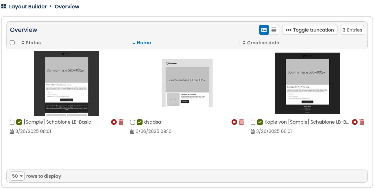
Fig. 12.3: The templates within the tab templates define the fixed frame of the mailing.
13.3.1.1 Creating templates
To create a new template, click the New button in the upper right corner of the Template submenu. First enter a name for the new template. If you are using the Layout Builder with Grid, the Grid selection will open. Here you select a previously created grid for your template. You will then be taken to the Settings section for the template.
In the Mailing Settings section, you can change the name and, if necessary, the grid again. In the Mailing Settings the mailing type, Archive, Show in online archive and Custom thumbnail are optional settings. By activating the Custom Thumbnail slider, a selection box appears that allows you to choose a custom thumbnail image to be displayed in the template overview preview. For more information, see the Creating a New Mailing chapter. In the Targeting Settings you specify the mailing list and, if desired, target groups, for which this template will be used in the future
Note: All specifications, except for the grid, can be changed later when you create a mailing using the template.
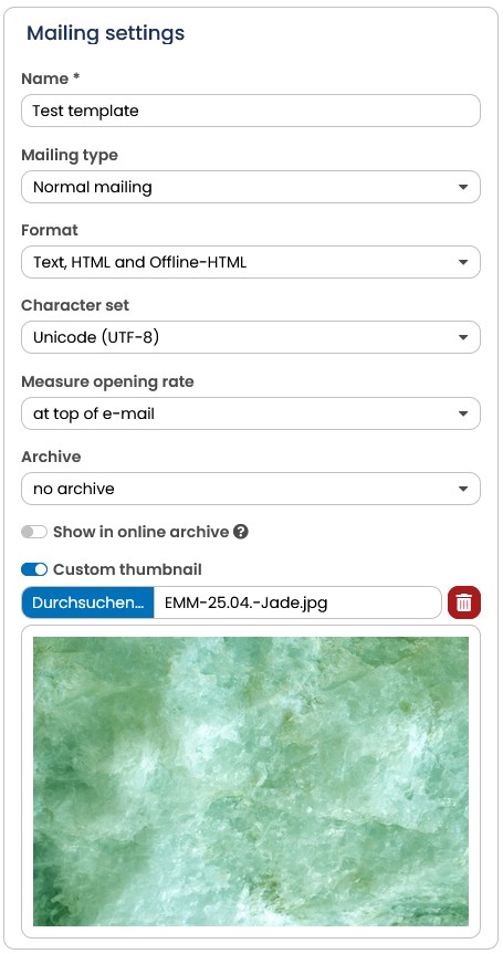
Fig. 12.4: You can define an own thumbnail for your templates in the tab general settings.
In the block Frame content you define the content for the text version and with the AGNITAS tag agnDYN you create dynamic text modules for the text version. Read more in the chapters agnDYN, Using text modules and Dynamic text modules.
In the Sender settings you specify subject* (probably a placeholder like "Please insert"), pre-header, format, sender email*, sender name, reply-to email* and reply-to name for the future mailings. In the General settings tab, you can also select the character set and specify where the measurement pixel is to be placed under Measure opening rate. Again, all specifications can be adjusted later in the mailing at any time.
* Subject, sender e-mail and reply-to e-mail are mandatory fields.
In the Targeting Settings, you have the option of preselecting target groups for the mailing. This makes particular sense if this template is always sent to the same recipients. With the slider Mailing should only be sent with target group selection you can force the use of target groups when sending. If this template should always go to only a subset of your recipients, because the template is used for a longer-running test, for example, select the appropriate setting under Split mailing. You can change these settings later when you create a mailing using the template. For more information, see the chapter Creating a new mailing.
If necessary, you will also see the Mailing Parameters section. For more information about this section, see the Mailing Parameters chapter. (contact the support if you are interested and we will send you the documentation).
As soon as you confirm your entries with Save, the tabs Content, Text modules, Template, (Styles), CSS, Links and Preview appear.
After saving, you will also see the Action button, which you can use to copy, delete, export the template or generate a mailing from it.
13.3.1.2 Adding content
When you open the E-Mail Creator tab for the first time, you don't see much of the mailing at first. But the impression is deceptive, because the foundation has already been laid: The area in the center of the window shows the canvas on which you can place the building blocks.
If you use the Layout Builder with Grid, you will see the grid you selected when you created the template. You can see the number of columns defined in the grid - in the example below there are three columns.
If you use the Layout Builder without a grid, you will first be shown an empty row (as can be seen in the screenshot).
To add a new row, simply drag a new building block into the editor and drop it there.
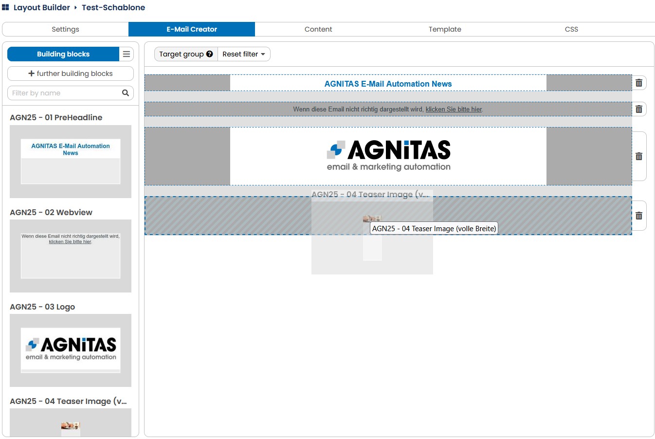
Fig. 12.5: Drag the desired building block into the editor to add a new line.
If you notice when editing the newsletter that you have one line too many at one point, you can remove it again. To do this, click on the trash can next to the in the bar on the right. The building block used in this line is then displayed in the Recycle bin tab. As long as you do not open the recycle bin and finally press the Delete button, the status of this block remains "in use".
Only in the Layout Builder with grid you will see an arrow symbol in the bar on the left side. By clicking on this symbol you can insert or hide spaces (about 25 pixels) between the lines.
In the next step you insert the blocks into your template. In the column on the left, all active blocks are offered to you. If you have more than 50 active blocks, a scroll function appears. All the blocks listed there can be conveniently dragged and dropped onto the template and placed at the desired location.
In the Layout Builder with grid, you can adjust the width and height of the element as soon as you have placed it. To do this, click on the arrow symbol on the left or right edge of the module and drag the element to the desired width while holding down the left mouse button. You can also change the position of the element - simply drag and drop it to the desired position.
In the Layout Builder without a grid, the block is automatically stretched to the full width of the line. You can change the position of the building block again at any time by dragging and dropping.
When you move the mouse over the building block, three icons appear. Double-clicking on a building block opens the editing window for this block. Here you can specify the contents for the later mailings, depending on the module different input fields are offered. Initially, you will always see the standard contents here that were stored in the module itself. One input field is identical in all modules - at the very top there is a selection menu target group with which you define who will see this module later. When you have finished editing, confirm your entries by clicking the Save button. With the blue icon appearing in the top right corner of a building block, you can Copy the block and its contents. The block will be pasted next to it, if there is space available, or otherwise into a new line below it. If you want to remove a block again, simply click on the trash can.
Tip: If you want to insert a deleted block again, you will find it in the left column in the Recycle bin tab.
In the lower right corner of a building block, you can see which target group has been stored for this block without opening the editing view.
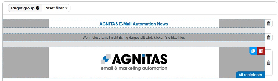
Fig. 12.6: The template starts becoming the desired shape by adding and adjusting the building blocks.
For each new building block, follow the same procedure: Drag a module onto the template, define its content, and adjust its position and size if necessary. If you want to display different content for different target groups at one position, simply stack several modules on top of each other. Each module is assigned to a target group and filled with the corresponding content. You can recognize stacked areas by a blue border, and you can use the small arrow in the bottom left corner to scroll through and access the stacked blocks. The number next to the arrow always indicates the level you are currently on.

Fig. 12.7: You can stack building blocks in order to send different content to different target groups while the building block remains in the same position
Tip: Don't forget to Save your progress regularly so that you don't lose your input.
If you want to ensure that certain building blocks cannot be changed or deleted, there is the option of restricting editing. To do this, the block itself must be marked accordingly. You can find out more about this in the chapter Creating a Building Block.
13.3.1.3 Prefill Textblocks
You can prefill default content for text blocks, e.g. footer, in your template. In the Content area you will see all dynamic blocks that you have added to your mailing, e.g. frame content or subject, with the tag [agnDYN].
A typical use case is that you want to use different subject lines for different target groups or you want to adapt the text variant of your mailing for different target groups. How to insert different content for different target groups in the same place is explained in the chapters Create dynamic content in standard method, agnDYN and Dynamic text block.
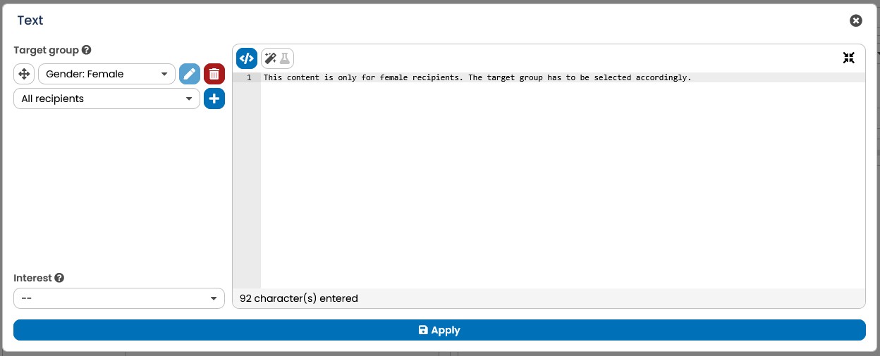
Fig. 12.8: In the Content menu you can define target-group-specific content for your textversion, subject oder sender email.
13.3.1.4 Template tab
In the Template tab, you will usually just keep the default content. However, you could optionally use HTML to insert content in this area that is not inserted via the building blocks, but rather forms a fixed frame around the body, so to speak. You can check your entries with the Refresh Preview button at the top right.
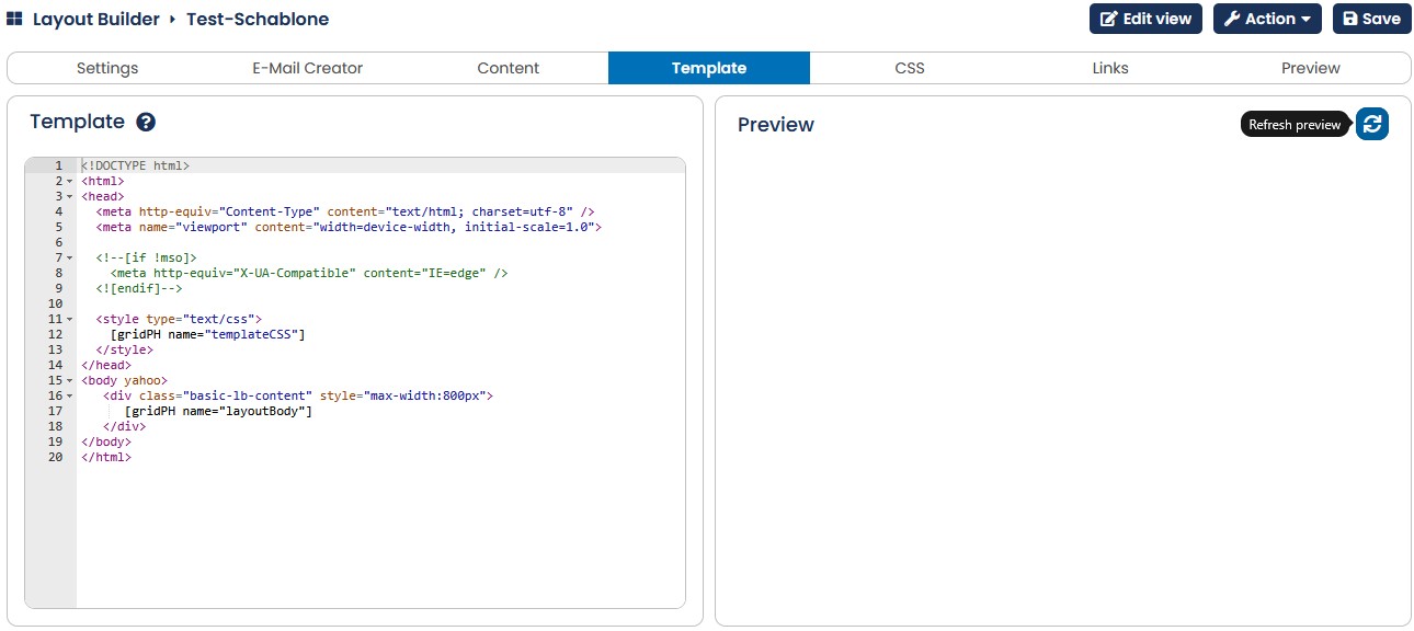
Fig. 12.9: In the template tab you can insert fixed content around the body of a mailing via HTML.
13.3.1.5 Styles
The Styles tab is available only in Layout Builder with Grid. (Note: the Layout Builder without grid pulls all style specifications from the CSS tab).
In the Styles tab, you can easily set some color values for your template without using CSS specifications for it. The ranges are in detail:
-
Background: The background of the mailing outside the grid
-
Gutter color: The color of the spaces between the columns and rows of the template.
-
Background of building block: If not already specified in the module, the background color for the module.
-
Font color: The default font color, but only comes into play if no color values have been specified in the building block.
Set the desired color with the help of the color selection box at the rightt. In the middle you will see a preview of your color settings. Clicking on Save saves these for the layout of your mailing. This modifies the current CSS file but not the standard CSS file.
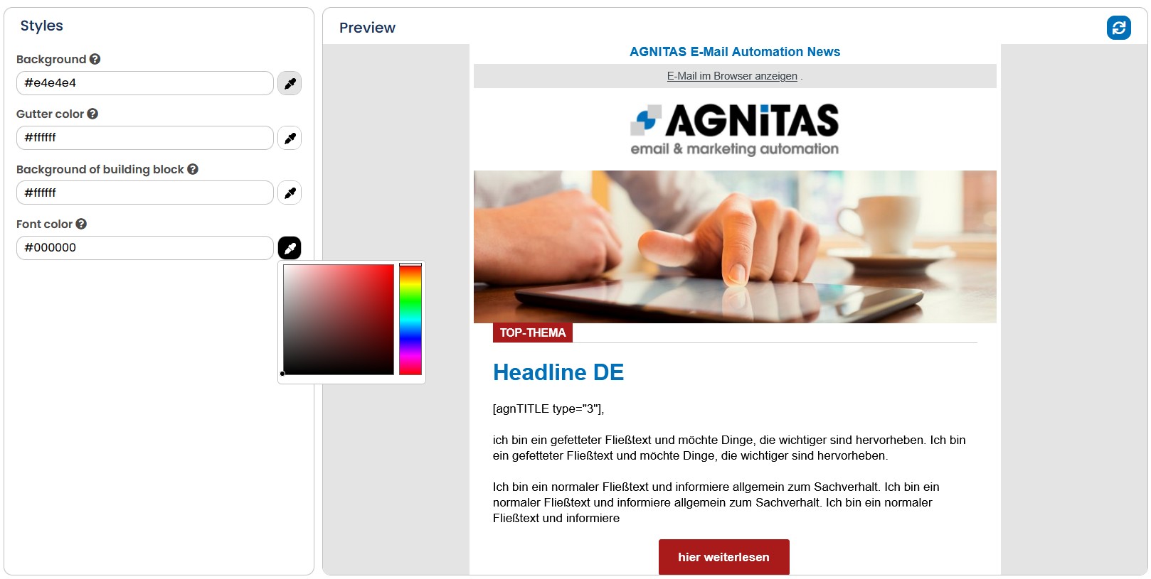
Fig. 12.10: By using the Styles tab, you can adjust the color settings for your template
Note: Later changes to the styles can optionally be transferred to mailings that have not yet been sent by saving them.
13.3.1.6 Editing CSS files
To change formatting templates, you can edit the underlying CSS file. You access this file by clicking the CSS tab in your template. You can edit the CSS specifications there directly.
In the CSS tab, you will see two subtabs: Default and Individual. In the Default section, the basic CSS specifications are predefined by AGNITAS. In contrast, Individual is the area where you can enter and maintain the style specifications of your template, such as colors, fonts and reponsive behavior.
Note: The Layout Builder without grid accesses only the specifications in this area. This thus offers you complete transparency over all the style specifications of your template.
Your changes are immediately visible in the preview window. Under View, you can select which device you want to preview for, so you can directly check the impact of the mobilerelevant specifications.
Don't forget to save the template after you have edited the CSS. If there is already formatting in the individual modules, these take precedence over the CSS settings.
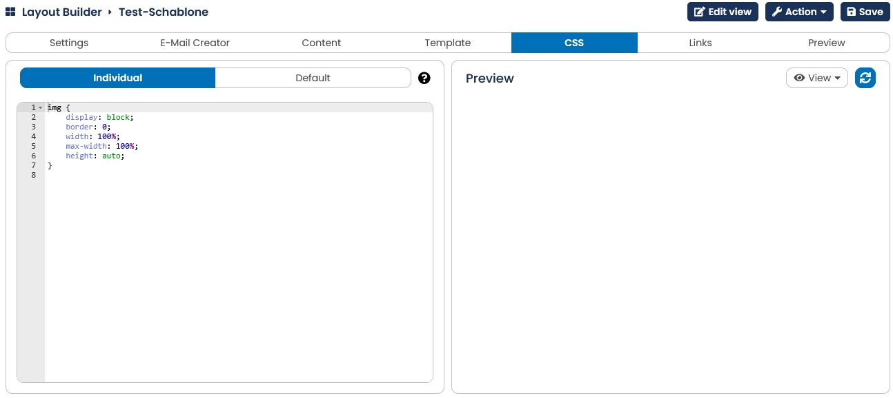
Fig. 12.11: You can choose between default CSS or an individual CSS.
13.3.1.7 Link settings
You can specify individual settings, e.g. for tracking or link extensions, for the default links of your template. For more information on the individual options, see the chapter Editing links.
13.3.1.8 Preview Tab
When you are ready with the content, you can preview your template for different test recipients and devices using the preview function. The preview works the same way as in the mailing, you can learn more in chapter Preview - For in-depth checking.
13.3.2 Creating and managing a grid
This chapter and its subsections refer exclusively to the Layout Builder with Grid.
E-Marketing Manager lists all grids in the Grid menu by showing a preview. Every line of the table begins with the name of the grid followed by information on the number of columns, column width, distance between columns and the template width. Via the two symbols in the right-hand column you can edit the template or delete it from the table.
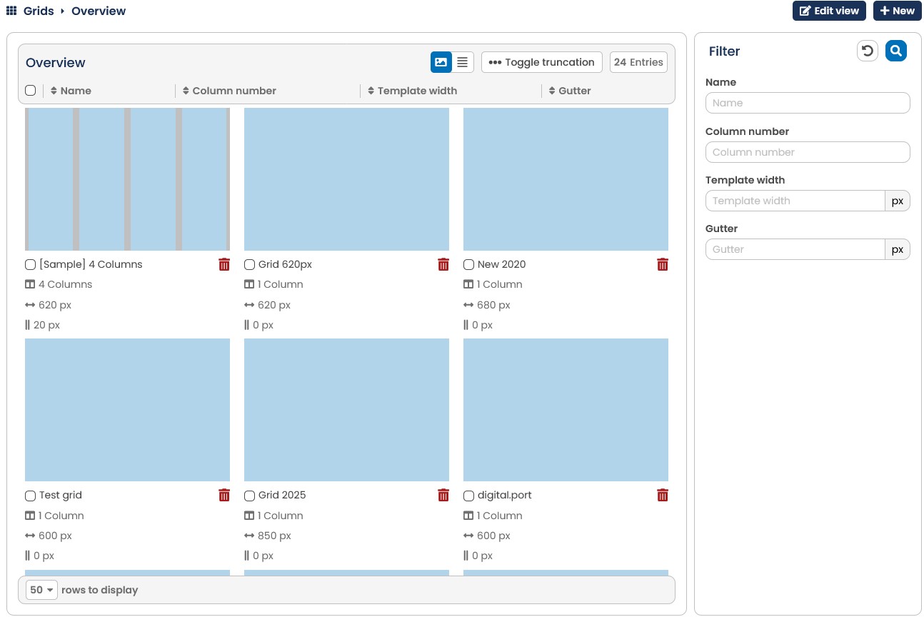
Fig. 12.12: The templates in the Grid submenu determine the width of the newsletter.
13.3.2.1 Creating a grid
To create a new grid, click New in the Grid submenu. First, enter a name for the new grid. After you have entered a name for your grid, the edit function opens. Here you can select the number of columns, grid width, column width and column spacing.
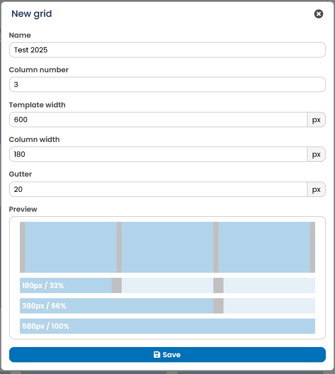
Fig. 12.13: E-Marketing Manager shows a new template in a practical preview.
To adjust the newsletter width, enter a value in pixel px for Grid width. You can also define the total width via the column width by entering a fixed value in pixel px here. If there should be a space between the columns, enter it in the field Column spacing. The outer column spacing is divided in half between the left and right sides.
The three sizes influence each other and the grid width is calculated by the number of columns times the sum of column width plus column spacing.
Note: For a better overview, the in the lower half of the window shows you a preview of the grid based on your current entries. The preview also updates automatically as soon as you change any of the following values: number of columns, grid width, column width, column spacing.
Both when creating and editing a grid, the at the very bottom of the window shows the width of the various columns both as a percentage of the total width and in pixel count. Both of these will help you choose images and post sizes correctly and fit them to the overall layout.
Once your grid has appropriate shape, click Save to apply your settings.
13.3.2.2 Editing grids
You can edit a saved grid by clicking on the name of the grid in the Grid menu or clicking on the Edit Grid symbol. Then you can edit the grid parameters as described in the previous section. Store your changes with the Save button. If you want to delete a saved grid, click on the button Action in top right corner. As soon as a grid is being used, you can change nothing but the name.
13.3.3 Creating and managing building blocks
The Layout Builder building blocks are called from the Building blocks submenu. You can create a new block directly by clicking the New button (for more information, see the chapter Creating a building block). You can also import ready-made blocks from other clients by clicking the Import building blocks button under Action. You can only import building blocks that have been exported from a EMM client before, as a special data format is required for this.There, E-Marketing Manager shows you all the building blocks already stored in the form of a table together with their names and additional information. If the building block is marked as blanked out, it is not available for use in a template. When you want to find out where a building block has been used, move the mouse to the Status column. The Mouse-over tooltip will show the templates and mailings that are using the building block.
The Filter option can be used as usual to find a specific building block. In the first column of the table, you also have the option of selecting individual or all blocks and using the corresponding icon in the table header to execute the actions Activate all, Deactivate all or Export selected blocks.
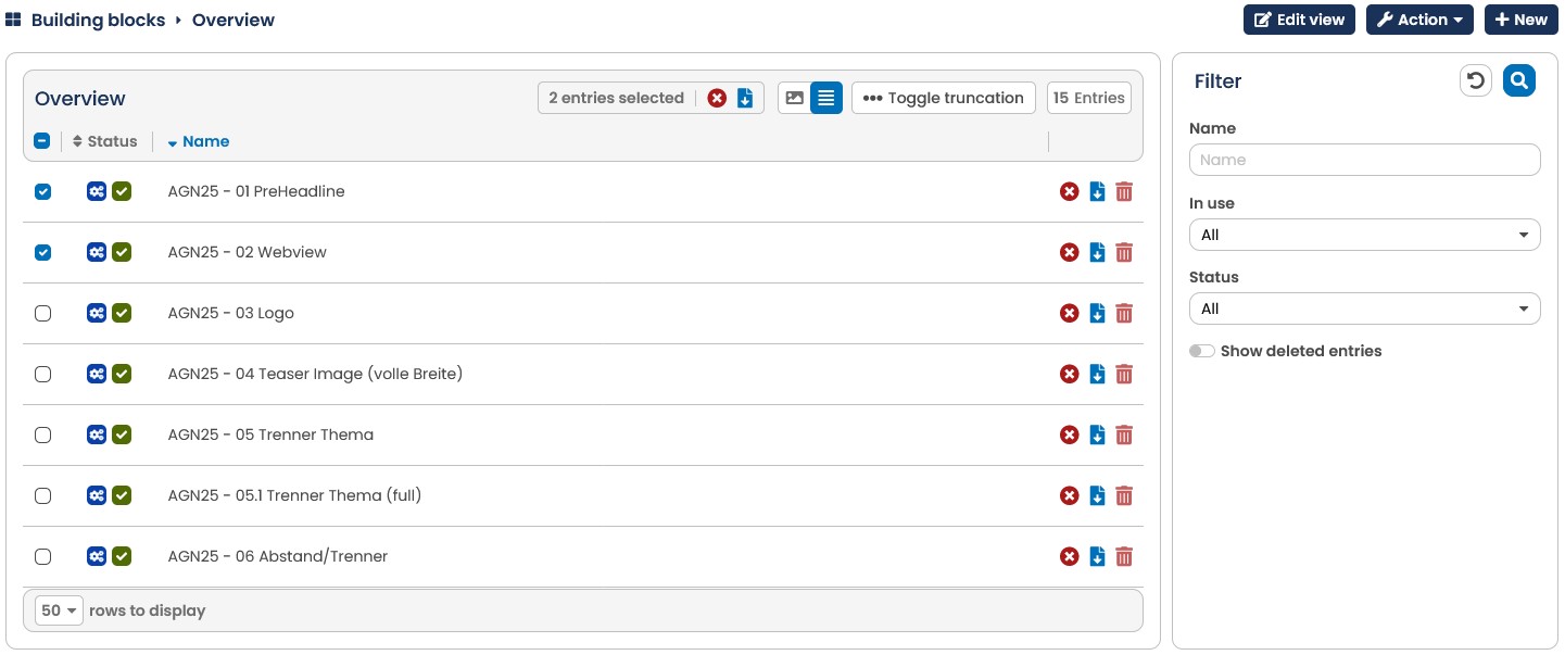
Fig. 12.14: In the submenu Building Blocks, existing building blocks can be managed and new blocks can be created.
To change the content of a building block, click the building block. The name of the building block can be changed. The HTML code can be modified on the right side of the screen and the building block can be activated / deactivated via the Action button. Clicking Save will make E-Marketing Manager save the changes.
To delete a building block, click on the Delete icon in the table. To Copy a building block, click the Action button in the detail view.
Note: Before a building block can be deleted, it must first have been disabled and may not be in use.
13.3.3.1 Creating a Building Block
You create a building block by clicking on the New button in the Building blocks menu. First, give the building block a name. You can use the gear icon to see at a glance whether this module is used in a template. If this is the case, the icon appears dark blue and lists the mailings in which the module is used on mouseover.
For Layout Builder, E-Marketing Manager utilizes the \<div> (abbreviated form of "division") known from HTML, used for the creation of complex webpages. The placeholders for each building block, for example image and text elements, are accordingly defined by conventional HTML commands that are embedded between \<div> and \</div> commands.
An example: In the picture below the disk container is shown on the left in the same way as it appears in E-Marketing Manager, and on the right the corresponding source code.
First assign a unique name in the Name field so that you can recognize your module without any doubt later on. This is especially important if you create several similar blocks. With In use you can see at a glance whether this block is used in a template. In the Content and position selection menu, you can specify whether the content of the building block may be edited, repositioned or deleted in the subsequent mailing. The options Freely editable, Fixed content, Anchored in mailing and Fixed content and anchored in mailing are available for selection.
Under Mode, you can use the Repeating Module option to create blocks that are automatically inserted multiple times in the mailing. In the drop-down menu, you can choose between the fields Reference tables and Filter. In the first step, you select the reference table in which the contents for the building block are to be found. With Filter you limit the selection of the contents, e.g. to a certain category or values. The notation for the filter is "\$table.column == value". The name of the reference table must be prefixed with a \$ character. The name of the column, which must have the value, follows separated by a dot. As operator two is-equal characters follow and then a value (string in apostrophes), e.g. \$article.productid == '123456'. Note: Normally, the contents are inserted in ascending order of the ID column. If you want a different sort order, just contact us. You then define which content is inserted into the module and how in the Frame content section on the right.
Note: The Repeating module option requires the Retargeting Package and can be activated on request. Please contact your account manager for this.
If you select the Reference table placeholders option under Mode, you can then select a reference table whose content is relevant to your building block. If you copy the listed placeholders and paste them into the frame content, values based on the key column of your reference table are then used and statically inserted into the placeholders of your building block. Unlike agnITEM, this method pre-fills the placeholders rather than dynamically transferring them at the time of dispatch. The contents can be edited retrospectively.
If you activate the Custom thumbnail selection, you can upload your own thumbnail of the building block as an image. This view then appears in the building block overview in the right-hand column next to the mailing. The advantage of an own thumbnail is that the final layout of the building block can be shown there and no foreign CSS influences the display.
In the Frame content section, you define the content and display of the building block. In the chapter How to make a Building Block you will learn more about the possibilities for the design of the code.
Please note: The Layout Builder with Grid uses the command \<div> known from HTML with which complex web pages can be created. The placeholders of each module, for example image and text elements, are accordingly defined by conventional HTML commands, which are embedded between and statements. Since common email clients display div statements correctly only to a limited extent, the E-Marketing Manager converts the div structure into a table readable by any mail program.
Please also note: In the Layout Builder without grid, in contrast, no \<div> container is needed and accordingly should not be used.
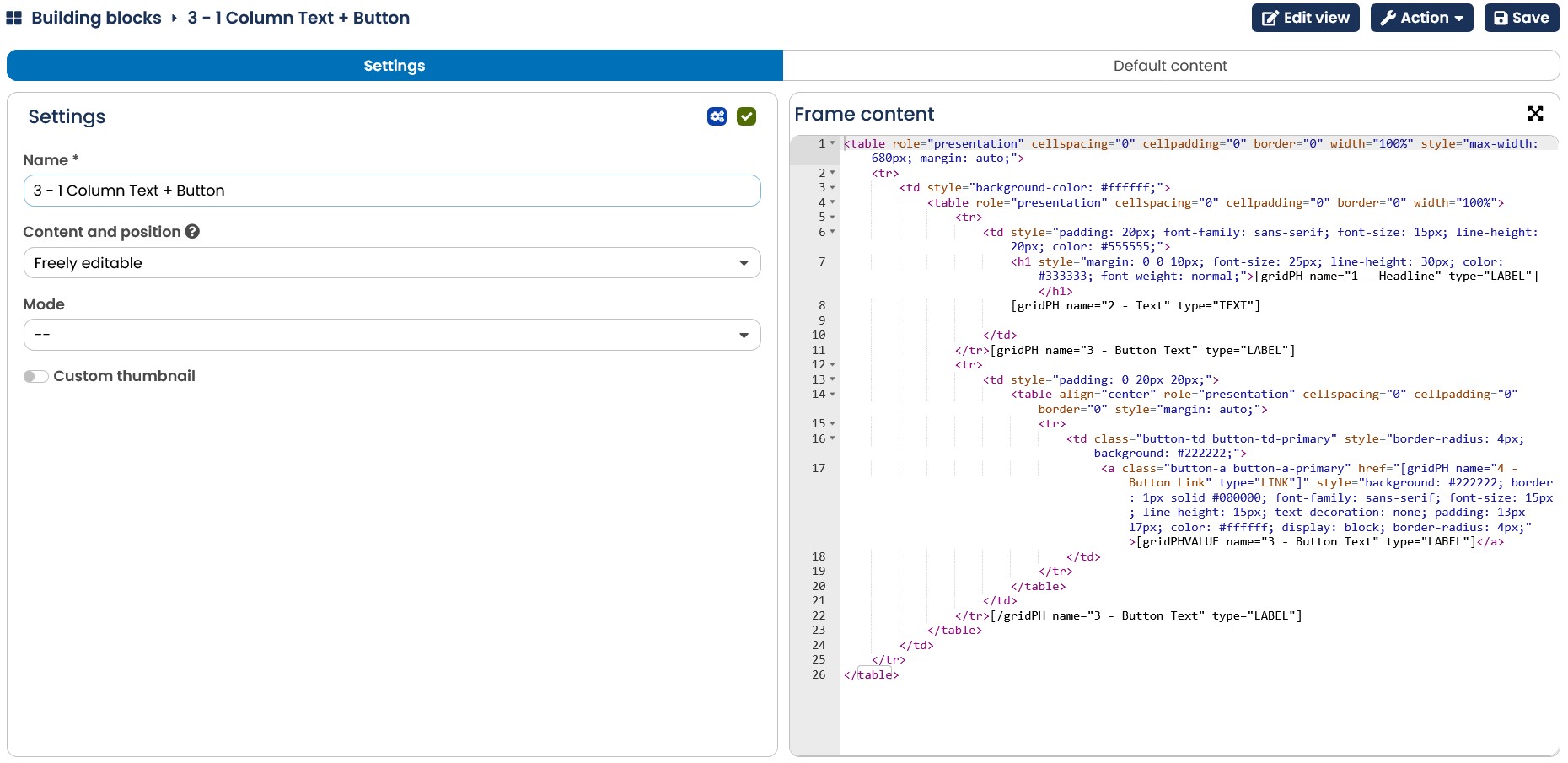
Fig. 12.15: The elements of a Building Block are defined by HTML commands.
Since the type and the form of the various Div-Container generally are repeated, and because these Div-Container have the character of a master template (i.e. they can be shifted around at will and their width and height modified) it can be assumed that a basic set of Div-Container is all that is needed to create newsletters.
A basic set would for example comprise the following building blocks:
-
Building Block for Fullview (can also be used if necessary for content such as Imprint and log-off link)
-
Building Block for header
-
Building Block for "text only" post
-
Building Block for "image only" post
-
Building Block for "image left - text right" post
-
Building Block for "image right - text left" post
-
Building Block for "2 images and text centered" post
-
Call-to-actions "Button" module
-
3-column blocks (for Layout Builder without grid)
-
4-column blocks (for Layout Builder without grid)
If you need special building blocks (such as div-in-div constructs or complex imagemap building blocks), you can of course set them up yourself. Alternatively, the AGNITAS support is always at your disposal.
After you have created your block, confirm your entries with Save. As soon as your block is saved, the button Action is offered in the header. The following actions are available: You can copy, delete and activate the block as well as perform an export. The exported module can be re-imported into another client at any time and will be created in JSON format.
The detail view of a building block displays the Settings tab as well as Default Content tab. In the Default Content tab, you can already enter texts and images for the placeholders that will initially be displayed in the template when the module is used. To make working on the content easier, just enlarge the editor using the button in the top right corner.
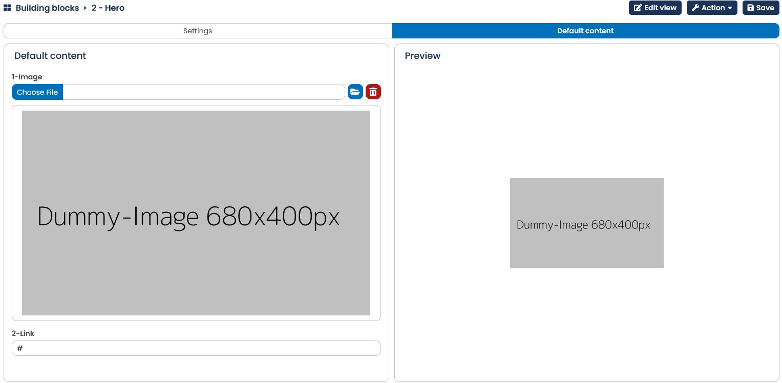
Fig. 12.16: Building block default content
Use Action to specify whether the block is activated for use in templates. As long as the Activate option is suggested, the block is not offered for selection in templates.If you deactivate an already activated building block again, the block will not be removed from already existing templates, so as not to remove any existing content. With a click on Save your changes get saved.
13.3.3.2 Design Building Block Content with gridPH Tags
A Building Block for Layout Builder consists of HTML text that can be freely formulated between the tags \<div class=“div-container“> and \</div>.
To build in a variable, the HTML text must contain the following building block:
[gridPH name="text" type="type"] What defines text and type?
-
text: the designation of the variable. To give greater clarity, the designation should clearly indicate what the variable replaces. When the Building Block is filled with content, the fields are alphabetically sorted according to this designation.
-
type: The following variables are available for type:
| IMAGE | An image can be pasted in. |
|---|---|
| LABEL | A non-editable text is pasted in. This could be, for example, headers that are always the same size or Alt-texts for images and designations for links. |
| TEXT | A longer text that can still be edited when filling the Div-Container. |
| LINK | A URL for a web link. |
| IMAGE_SRC | An image can be inserted from an external source |
| SELECT | Allows to display a dropdown with predefined values in EMC modules, e.g. for colors or for text alignment. Example: [gridPH name="Alignment" values="right:left, middle:center, right:right" type="SELECT"/] |
| COLOR | Creates an input field for color codes with a color picker incl. check whether the color code was specified according to a valid scheme (e.g. for white: #FFFFFF) |
-
values: The parameter values is only used in connection with the type SELECT and defines the selection list. The individual values are listed separated by commas. Example: [gridPH name="Ausrichtung" type="SELECT" values="left,right,center"]
-
help: You can use the help parameter to display mouse-over text to the user to provide filling tips or explanations.
Example: [gridPH name="Price" type="Label" help="Please enter the price with two decimal places. The currency will be added automatically."]
- toc: This parameter occurs exclusively in conjunction with the type LABEL and name="Headline" and is used to create a dynamic table of contents in the newsletter, more in chapter Creating a table of contents. Notation: [gridPH name="Headline" type="LABEL" toc="yes"]
For the formatting of the Building Block, E-Marketing Manager utilizes a CSS file. In the file, classes can be defined or edited for each Building Block. The standard classes and definitions can be found in the standard CSS file that you can download from every template. To do so, in the Edit view click on the Download standard CSS button.
For example, a building block for the Layout Builder with grid might look like this:
\<div class="div-container">
\<img class="div-container-image1" src="[gridPH name="Image URL" type="IMAGE"]" alt="[gridPH name="Image Alt" type="LABEL"]" width="100" />
\<span class="div-container-heading">[gridPH name="Überschrift" type="LABEL"]\</span>
\<p class="div-container-text">[gridPH name="Body" type="TEXT"]\</p>
\<a class="div-container-link" href="[gridPH name="Link URL" type="LINK"]">[gridPH name="Link Text" type="LABEL"]\</a> \</div>
The same building block for the Layout Builder without a grid could look like this, for example:
\<img class="module1-image1" src="[gridPH name="Image URL" type="IMAGE"]"
alt="[gridPH name="Image Alt" type="LABEL"]" width="100" />
\<span class="module1-heading">[gridPH name="Überschrift" type="LABEL"]
\</span>
\<p class="module1-text">[gridPH name="Body" type="TEXT"]\</p>
\<a class="module1-link" href="[gridPH name="Link URL" type="LINK"]">[gridPH name="Link Text" type="LABEL"]\</a>
You also have the option of using dynamic building blocks. These differ in that the modules are only displayed if they are filled with content. In this way, you can equip templates with all possible modules, but only the relevant modules are contained in the finished mailing.
You can use the gridPHValue tag to define the block so that it is hidden if it has no content.
Example:
[gridPH name="Special offer" type="IMAGE"]] ...source code...
[gridPHVALUE name="special offer" type="IMAGE"/] ...source code...
[/gridPH name="special offer" type="IMAGE"]
With the line [gridPH name="Special offer" type="IMAGE"] you initiate an area. Note that the slash / is missing at the end of the tag. The EMM now knows that he should not insert a content module, but something else. This is followed by the source code that defines how the content is to be displayed, e.g. alignment, spacing, colors, etc. The new tag [gridPHVALUE name="Special offer" type="IMAGE"/] now includes the image for the special offer. Finally [/gridPH name="Special offer" type="IMAGE"]. Note the slash at the beginning of the tag. This tells the system that this tag is the end of the area. It is important that you enter the same name for the module in all three tags.
If the module "Special offer" is missing or not filled, the EMM removes all contents between [gridPH name="Special offer" type="IMAGE"] and [/gridPH name="Special offer" type="IMAGE"]. In the finished newsletter, neither a blank line will be visible nor any other formatting from this module.
Please note: You can only use one \<div>/\</div> section per module (only for Layout Builder with grid).
Please also note: Since the dynamic blocks represent a drastic change in logic, the function is turned off by default and must be explicitly turned on via the company_info_tbl (cname="clear-empty-dyn-block", cvalue="true"). Contact AGNITAS support if you have any questions.
13.3.3.3 Creating a table of contents
If you have purchased the Layout Builder premium feature, you have the option of creating a table of contents for your mailing.
You can use an existing template and integrate its table of contents directly into the mailing. For practical reasons, however, we recommend creating a new template, since your modules need to contain special variables.
You can place the module that creates the table of contents wherever you like in your template. It has a fixed structure.
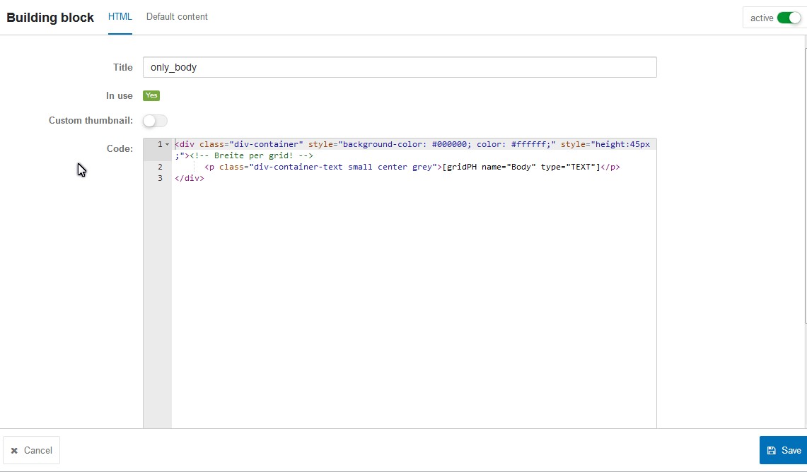
Fig. 12.17: To create a table of content you need the fixed building block structure.
Your underlying content module could be structured as follows:
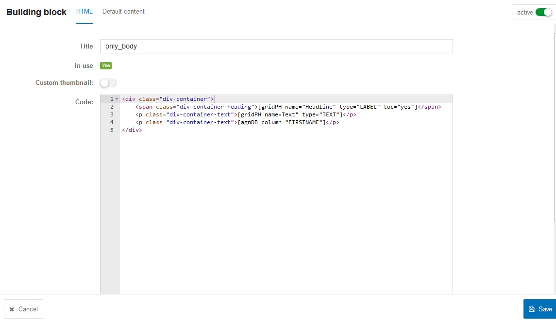
Fig. 12.18: You need a fitting structure in order to display your building blocks correctly in the table of contents.
Your module must include the following gridPH tag: [gridPH name="Headline" type="LABEL" toc="yes"] Otherwise the table of contents will not display your module. The tag adds the option "Display Headline in Table of Contents" – activating this approves the module for the table of contents. The gridPH name can be chosen arbitrarily by you (e.g. headline) and displays accordingly in the module.
Note: If you automatically insert a table of contents in E-Mail Creator mailings, then the target group selection in the module is also taken into account in the table of contents. This means that only people who see the module will see it in the table of contents.
13.3.3.4 Importing building blocks
If you click on Action and then Import building blocks in the overview, you will be prompted to select a corresponding file in the next step. With the Overwrite existing building blocks slider, you can specify whether existing building blocks are to be updated or the building block is to be newly created. The update is only possible if the block to be imported and the existing block use exactly the same name. Only building blocks that have been previously created and exported in a client can be imported. If you have selected your file, then execute the import by clicking on Import building blocks. The imported building block is now displayed in the overview and can be further edited there.
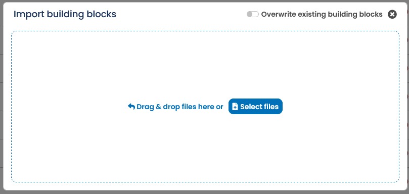
Fig. 12.19: Import building blocks
13.3.4 Creating a new EMC mailing
You can also create a new Email Creator (EMC) mailing directly based on a template. Once you are satisfied with the appearance of the template, click Save one last time. Then go to either the Settings or E-Mail Creator tab, click the Action button and then click Generate Mailing. After that, the already familiar Mailing dialog will open.
In the mailing dialog you define the base settings of the EMC mailing. Here you give your mailing a name, can make settings regarding mailing list and mailing type or change details regarding your email, if you do not want to take over the default settings of your template.
After clicking Save, the E-Marketing Manager creates the new mailing. If you need to make any changes to the content, click on the E-Mail Creator tab. The E-Marketing Manager now shows you the contents of the template, which you can now conveniently edit or adjust via drag & drop position as desired. You apply your changes by clicking Save.
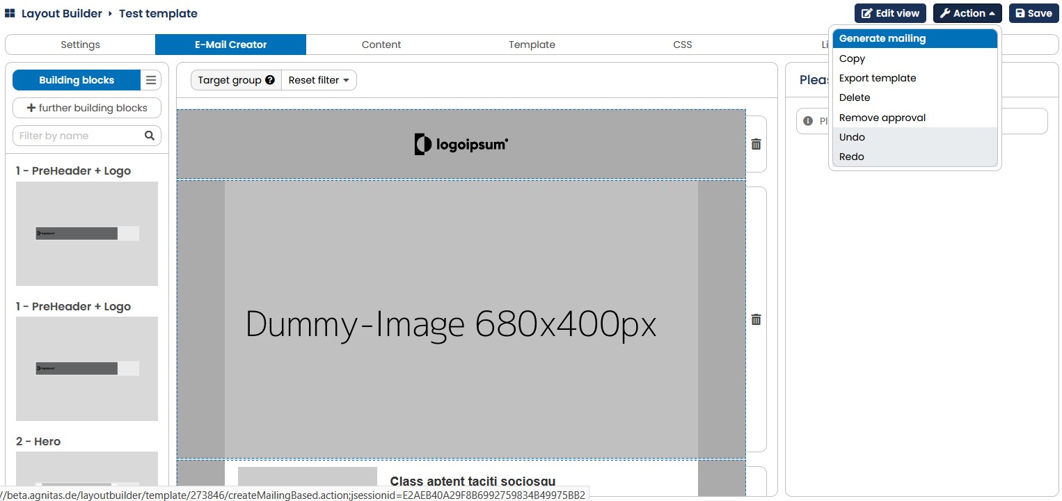
Fig. 12.20 You can also create a new mailing directly from a template and customize it as you wish before sending it.